In my arts integration class, I teach middle school students filmmaking with the help of English principles…to make an animated film. Because of time, funds, attention span, etc., we are doing everything but actually animating the film. So, it’s all the pre-production stuff. One of the goals of the project is to introduce the students to professions they have an interest in. At the beginning of each semester, they chose their own film departments and the assigned work was used to not only complete the film but to explore the universe of the filmmaking process; those “pieces” included creating a podcast about the project and an audio book that expanded the story and the script. In some cases, the students were paired with a mentor from their department…again, not just their film department. A student who designed buildings for the film (including our hospital) received tutoring from an actual architect. As of right now, he doesn’t want to be a filmmaker, but loves to draw buildings. So the value for him, as a 7th grader, would be to learn about architecture. The architect’s intern also professionally rendered my student’s drawing.
“I want to show them the validity of their ideas.”
Basically, I want to show them the validity of their ideas. It’s their ideas—what they put on paper—that drive the project.
From Analogy to Cover Art:
Understanding Context to Explore Real Jobs
Instruction & Activity
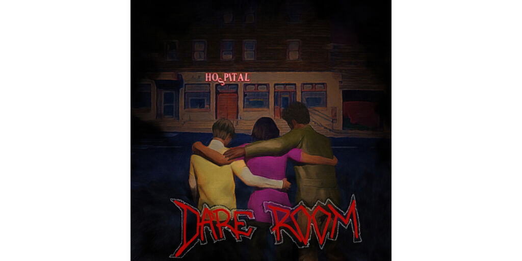
I’m William Bryant Rozier. My aforementioned project/film is called Dare Cycle. For this “piece” of the project, three voice-over actors (and one photographer) delved into the wonderful world of Cover Art design for their podcast, Dare Room. (Dare Cycle is kind of a horror film, so the Dare Room podcast is equally moody.) To do that, I used analogy lessons that I’ve been slipping in throughout the project since we began in 2021. (In my work, I design to themes and I talk in metaphors, more than anything. And I’m someone who notoriously cannot draw so I hire talented folks all of the time, to do what I can’t.) The three voice-over actors represented three distinct characters, so the initial results were individualistic. For your class, have each student do their own work. It’s point-of-view storytelling, about how they interpret and explain adjectives and adverbs. We needed a central image for the piece. Because it all begins with characters (internal struggle, external struggle, etc.), I instructed my students to answer the following:
1. Pick one word/adjective to describe your character? What’s your character’s theme?
2. Now, come up with an image(s) to symbolize the word.
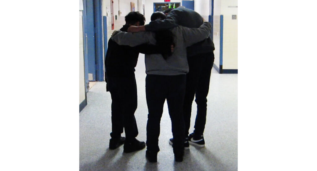
The word SUPPORTIVE was used to describe the character ISABELLA; the students then voted it winner out of the three options (in part) because the image of a huddle was the strongest visually. They felt it would best describe their relationship. We photograph all of our references in the Dare Cycle class.

HISTORY CLASS TOO: But this also applies to any non-fiction/history lesson. If you want someone to make a cover art image/logo about Dr. Martin Luther King Jr.’s speech during the Civil Rights Movement, feel free to adapt the lesson. The point of the exercise is to design cover art for the podcast, right? But the students still have to explain what they’ve done; Dare Cycle is a big ole arts integration, English class. From the central image of characters supporting each other, my students wrote the following sentence:
The abandoned hospital is in the background with our characters half-hugging/huddling in front of it.
This scene takes place at night. Now we had to work on the background. For time purposes, I chose three random words to describe the hospital’s relationship to the characters: surrounds, aggressive, and secretive. I then asked my students to describe how each word looks.

But I had to impress upon them specificity. Their natural inclination is to be passive in their language, to shorthand everything. So I challenged them to explain further.

If the building is secretive, what does that look like? Their answer: Darker, like trying to keep a secret. But that’s not descriptive enough because how can you tell if someone is keeping a secret? Their answer: If they are acting suspicious. How can you tell if a building is acting suspicious? Their answer: If the lights are flickering. Just give them the avenue to keep asking questions, to be more specific. My students voted for the DARKNESS AS FOG answer for the cover art background. If the students suggested the hospital surrounds them…and it takes place at night…what else can surround someone at night? And what does that look like? Their answer about the hospital/darkness: It’s like walking in fog. So the sentence can be expanded to include the new information:
The darkness surrounds our characters, like they were walking in fog, as they half-hug/huddle in front of the abandoned hospital.
Again, it’s about showing the validity of their ideas. This is all that’s needed for design work, from what’s written on paper and argued over in a group to giving it to a professional artist to make it look dope. Throw in some creepy font, designed by another student, and we’re finished with the art direction.

NOW WHAT? SERVICE PROJECTS AND OTHER STUFF
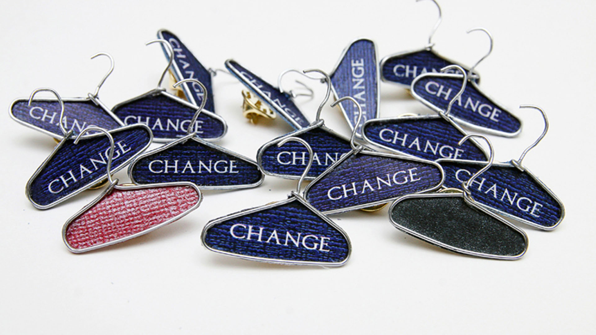
I’ve shown how working with analogies can be used to design cover art for a podcast, which is basically an identical twin to designing cover art for music, poster design, t-shirt design, etc. But it also opens the door for marketing and advertising, specifically to create service projects and community outreach for nonprofits. This project wasn’t for a class but for a former client; I designed CHANGE PINS for a local nonprofit. It was distributed to raise awareness for a clothing drive for Blue Jacket, a nonprofit that assists the formerly incarcerated after release. To show the transformative change that a donation to Blue Jacket can mean, I developed the concept and transformed hundreds of paper clips into clothes hanger pins: Change a Life…Donate to Blue Jacket.

I used analogies (my English degree) to develop the idea. What if you could partner with a local nonprofit, have your students distill a complicated idea into an image that you can make into a pin? It’s marketing/advertising, but it also extends the lesson outside of the classroom to make real change.
Resources
Please login or register to claim PGPs.
Alternatively, you may use the PGP Request Form if you prefer to not register an account.


