“When are we ever going to use this?” The dreaded, yet inevitable, question that arises every year for math educators. With the abstract nature of many standards in the high school math curriculum, I can certainly empathize with the sentiment of this question. At face value, it does seem like many standards lack any grounding in the physical world or relevance to the average students’ day-to-day life. Relevance may be a tough sell for some standards, but I’ve found that using real-world data whenever possible can go a long way in convincing students that the math we are doing is, in fact, actually connected to the real world. Through years of trial and error, I’ve finally settled on using Desmos, Google Sheets, and some well-vetted data sets to bring real-world data into the classroom. Generally speaking, utilizing real-world data in your classroom will involve four steps:
- Finding the data
- Cleaning and organizing the data
- Visualizing the data
- Drawing insight from the data
Let’s take a look at how these steps look using an example from my classroom!
Visualizing Data through 100-Meter World Records
When discussing linear functions, I like to use the 100-meter world record times since 1960 to explore the meaning of slope, the y-intercept, and correlation coefficient. I use this data set for three reasons:
- Students can easily relate to 100-meter times especially in an Olympic year
- The data is readily available on wikipedia
- The data shows a fairly strong linear correlation with just enough outliers to be interesting
Step 1: Finding the data Now, I could have students go out and run 100-meter dashes as I record their times, but that likely would not result in a nice linear relationship. However, decades of clean, easy-to-read data is literally right at our virtual fingertips. By doing a simple Google search you can get data on just about any phenomenon you want! 📌 Teacher Tip: For more curated data sets, you can use those provided by the National Council of Teachers of Mathematics. On their website they keep a well-organized list of data sets for just about any situation. Step 2: Cleaning and organizing the data Whether your class is collecting the data themselves or you found a data set on the internet, it is likely the raw data is not suitable to be put into a program for visualization right away. As an example, here is a screenshot of the 100-meter times data from Wikipedia.
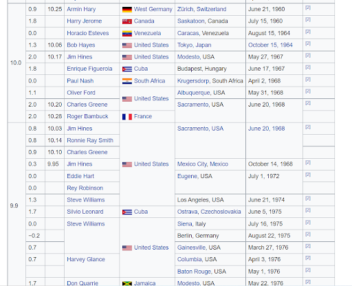
Notice the raw data contains a lot more than the two columns that we would like if we were going to investigate how the world record has changed over time. Even more, most of these columns do not even contain numerical data! In order to create any sort of visualization out of this data, we are going to have to do some clean up on this table. Of course, there are many ways to go about cleaning data, each having its own merits. I will typically copy the table from the source (Wikipedia in this case) and paste it into a spreadsheet. My personal favorite spreadsheet program is LibreOffice Calc, a free Excel clone. Once the table is in a spreadsheet we can really start making some moves. In the case of this particular table, you may notice that many of the cells in the left-most column are merged vertically when there were multiple “ties” for a given world record. My first step for cleaning this data would be to unmerge those cells, then delete any unnecessary columns. Also, since we want to investigate the world record data since 1960 we need 1960 to be our “zero point.” Thus, we need to overwrite the data in the date column so that 1960 becomes 0, 1961 becomes 1, etc. At this point, the data should start to look like something usable that we can visualize!
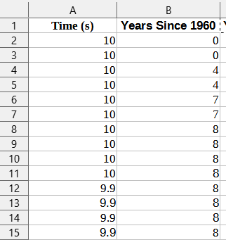
Depending on the program you wish to use, this data may already be good to use, however I prefer to use Desmos, as I suspect many teachers of math do. Desmos works very well with column data as you can generally just copy and paste into an empty cell. However, Desmos does require the independent variable be in the left column and the dependent on the right. In the table we have now, the opposite is true. Thus, we need to cut the left column that contains times and paste it to the right of the column that contains years (since 1960). Once this step is completed, we are now ready to visualize this data using Desmos! Step 3: Visualizing the Data Of course, there are many programs that can help us visualize mathematical data. I prefer to use Desmos in most instances because it is relatively simple to use, robust enough to be useful for any class taught at a middle or high school level, and produces stunning visuals compared to similar programs. To highlight its ease-of-use, in our current example, we can simply highlight our data in Google Sheets, copy the data, go over to a Desmos window and paste the data (using Ctrl+v) into a blank cell. The data will be automatically copied into Desmos, formatted as a chart, and plotted as a scatterplot in the graphing window.
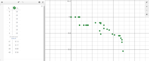
With just the scatter plot and data side-by-side, students may begin to see patterns and trends in the data, but we can do a little better! When Desmos formats your data in a table, it actually creates two lists; x1 contains the “x-values” of the data set and y1 contains the “y-values.” Since Desmos is equipped to handle univariate data as well as bivariate, we can plot lines denoting the mean year and time. To do this, go to an empty cell and type “x=mean(x1)” and in the next cell down type, “y=mean(y1)”.
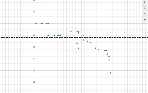
Now the data should be broken up into quadrants, which really allows students to clearly see trends and patterns. Also, since I use this during a lesson on linear functions, it makes sense to create a line of best fit for the data. To do this, go to another blank cell and type, “y1 ~ mx1+b”. This will create a linear regression with the lists x1 and y1, give the correlation coefficient, give the values for m and b, as well as plot the line of best fit in the graphing window.
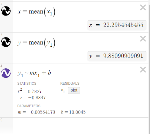
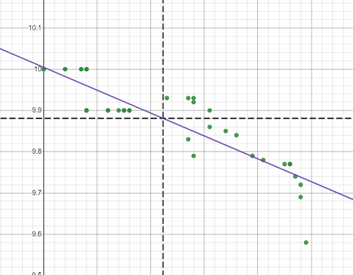
While there are many programs out there that can create scatterplots, regression models, plot lines, etc., very few do it as seamlessly as Desmos. You can go from raw data to a scatterplot with a line of best fit and annotations in a matter of minutes! Step 4: Drawing Insight From the Data Now that we have our data plotted as a scatter plot with a line of best fit and markers for the mean date and time, we can start to draw insight from the data. This is a great time as a teacher to step back and let students drive the discussion for a bit. What do they notice? What do they wonder? Before getting into technical details about the m and b parameters or correlation coefficient, I generally like to let students discuss what they feel like the data is telling us first. The wonderful thing about using this method of visualization using Google Sheets and Desmos is that it is simple enough that students do not get bogged down in the process and can focus more on the story of the data. Not only does the simplicity of this method allow for more conceptual discussions, but being able to draw from actual data helps students with the technical details, too. How many times have you had a student be able to identify the slope of a line, but not explain what that slope means? When you draw from real-world datasets, students are more likely to be able to identify what the slope means because the x and y axis are not just arbitrary axes. They stand for a real physical quantity! Conclusion One of the surest ways to bring relevance into the classroom is to use actual data from actual real-world phenomena. When the data is taken from the real world, students can immediately see why the math they are learning is useful. As we saw in this example, there is no shortage of data sets available on the internet, but you can really up the ante by having students collect the data themselves! For example, if you are covering quadratics, a simple experiment would be to go to the nearest set of bleachers and have students drop a ball from various heights and time how long it takes the ball to hit the ground. By performing the experiment and collecting the data themselves, students have a first-hand knowledge of where these numbers are coming from and vested interest in the data. The math they are doing isn’t just numbers on a worksheet, it’s describing a situation they witnessed first hand! Math teachers will likely never be able to eliminate the dreaded, “When are we ever going to use this question?” but using real-world data can at least help reduce the times students feel compelled to ask it.
Resources
Please login or register to claim PGPs.
Alternatively, you may use the PGP Request Form if you prefer to not register an account.


