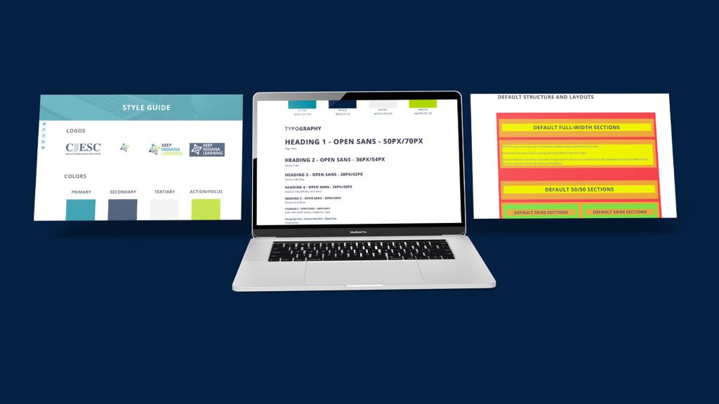
Have you ever had trouble finding specific logos, color codes, or font styles used for your business? Or maybe you are on the other side and struggle to communicate these assets to individual teams or outside organizations. A style guide will help provide these assets quickly and efficiently on a single page of your website.
A style guide showcases the main parts of your design and written language branding. The idea is it will help others to utilize and match your branding with defined guidelines for when they are creating content on behalf of your organization. We are going to dive in to what content a style guide should include, how to utilize it, and what you can do to get it up and running. Let’s begin!
Content to Include
Creating a style guide can feel like an endeavor as you try to gather all of the content. Do not feel like you need to have all of these content types in your style guide at launch! Start with the major types of content you frequently are asked to provide and grow over time with new sections of content as needed.
Logos
Logos are the most important asset to include in your style guide. Anyone creating for your organization will need to show your logo somewhere. Because you will not be creating the content yourself, you should include the highest resolution of each logo. Link each logo to the full size file URL for easy downloading.
For the most efficiency, be sure to include the following logo formats (as needed):
- full color
- dark single color (for light backgrounds)
- light single color (for dark backgrounds)
- all white
- all black
- the icon only (no words, like a favicon)

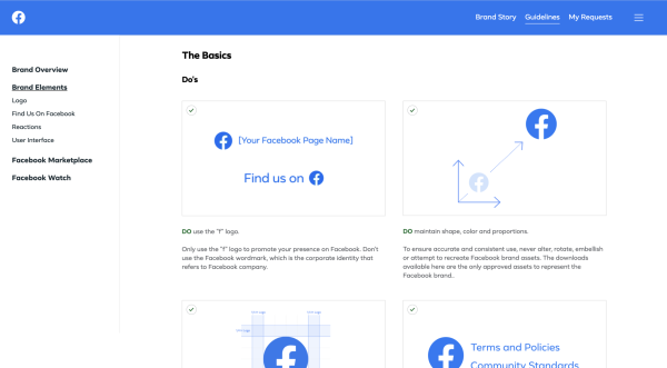
You can go further by including information on how the logo assets should be used, including placement and what not to do with the logo. Facebook does a great job in their style guide by giving visual examples of do’s and dont’s.
Colors
Branding colors for a company become instantly recognizable if used correctly. Big companies such as Facebook and Twitter use specific shades of blue that you can place apart from their logo. But these shades require a unique hex code value, an RGB value, or 3 numbers representing the hue, saturation, and lightness (HSL). Sometimes there may even be an alpha number or code at the end denoted transparency. Netflix’s style guide includes each logo next to the color breakdown for easy reference of the brand’s colors.
Your style guide page should help by showing an image or small area of the color and listing the values of various codes for the color (hex and RGB at the least). You can take it a step further by listing best practices for using the color such as “only for backgrounds” or “buttons and calls to action” to help others properly create materials that match your branding.
Typography
In order to prevent creating content with all the whimsical fonts that are available, it is best practice to include the main fonts your company’s brand utilizes. Each font should include information about the sizing, spacing, and use cases for each (example: section titles, page titles, body text content, etc.).
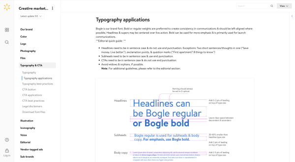
Walmart’s style guide includes an entire page dedicated to their custom created font and details guidelines on how best to use it.
Writing Guidelines
If you have many authors writing content that will appear on your website and in published works, you may want to consider including writing guidelines to your style guide as well. Define how you want certain topics described or labeled with examples. You may also want to consider adding information on how to write about people using inclusive language. Microsoft’s style guide includes tips on matching the brand’s tone of writing as well as a full page of guidelines on bias-free communication.
Default Content Structure
Some companies have multiple web developers or allow other staff to utilize easy page builders to create new website content. It is a good idea to include default layouts and content structures to help guide how to build content sections to avoid pages that appear out of place. Include the various layouts that are utilized across the site with different content types showcased. Be sure to define spacing between content items and sizing, if necessary.
Post or Content Type Layouts
If you have special content type pages such as event pages, blog pages, or team member profiles be sure to include a section defining the layouts of these pages as well. This will help future web developers or staff members easily jump in and not recreate the wheel to match other similar pages. Or worse, creating something completely different!
That is a lot of content. Where do I start?
Start small! Begin with the logos and colors and slowly build over time. This isn’t something you need to have complete right away. As new pages are created you can copy over layout and structure so it doesn’t feel like you need to comb through all of your pages at once to find everything. If you get asked for other branding assets that you feel like would be useful in your style guide, add them in! Keep coming back to it and building it up. This page should make your life easier by reducing requests for company branding assets and helping others ensure that content is created to match the rest of the company’s content. Take a look at what we do in our Keep Indiana Learning style guide to get some starting ideas.
The Style Guide is Ready...Now What?
Share it with everyone! Let all of your staff know the page exists so they can easily grab assets as needed. If you ever work with outside consultants or companies that need to create content that utilizes your branding, give them the URL to your style guide. This will create a more professional and polished feel to your branding and relieve you of all the emails asking for the same content. Do not let creating a style guide feel like a daunting process. Having to hunt for assets, resize logos, and constantly sending out color values has already taken up too much of your time! Help your staff and other content creators match your branding more efficiently!
Resources
Please login or register to claim PGPs.
Alternatively, you may use the PGP Request Form if you prefer to not register an account.


